The information in Charts 1, 2, 3, 4, and 5 is from the Bureau of Labor Statistics. The information in Charts 6 and 7 is from the U.S. Department of Labor Employment and Training Division. (Note: Data is periodically corrected on these sites, and those corrections are incorporated into these charts.)
| Chart 1. Monthly Change in U.S. Payroll Employment |
| Chart 2. Monthly Change in U.S. Payroll Employment - The Clinton Years |
| Chart 3. Monthly Change in U.S. Payroll Employment - The George W. Bush Years |
| Chart 4. U.S. Unemployment, from January 2006 to date |
| Chart 5. U.S. and Georgia Unemployment, from January 1993 to date |
| Chart 6. Initial Unemployment Claims, from January 2006 to date |
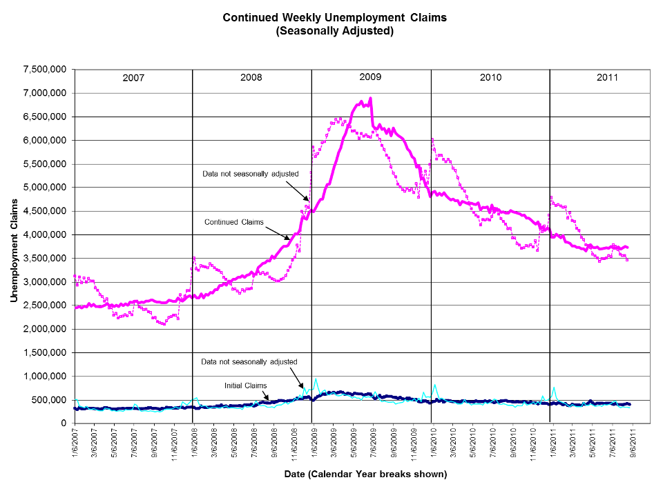
| Chart 7. Continued Weekly Unemployment Claims, from January 2006 to date |
| Information on Unemployment Insurance |
| Additional Classifications of Employed and Unemployed Persons |
The rule-of-thumb often stated about U.S. employment is that we need an average of roughly 150,000 new jobs each month just to keep up with the growth of the population—that is, the number of people who become old enough to enter the work force LESS the number of people leaving (retiring from, etc.) the work force.
Chart 1. The chart below shows that the economy was NOT producing this average number (the dashed line) in 2007; and the net loss in jobs each month through 2008 and 2009 looks even worse when the jobs needed to keep up with population growth are added on.
Job losses hit bottom in January 2009 (the month President Obama was inaugurated).
Note: This chart is for "Payroll Employment" reported by employers. The most recent month is "preliminary" data and is often corrected when the following month's data is released.
This data is based on a monthly sample survey of about 150,000 businesses and government agencies covering approximately 390,000 establishments. It excludes the unincorporated self employed, unpaid family workers, agriculture and related workers, private household workers, and workers absent without pay. It does include the logging component of agriculture and related industries. "Employment from the BLS household and payroll surveys: summary of recent trends."
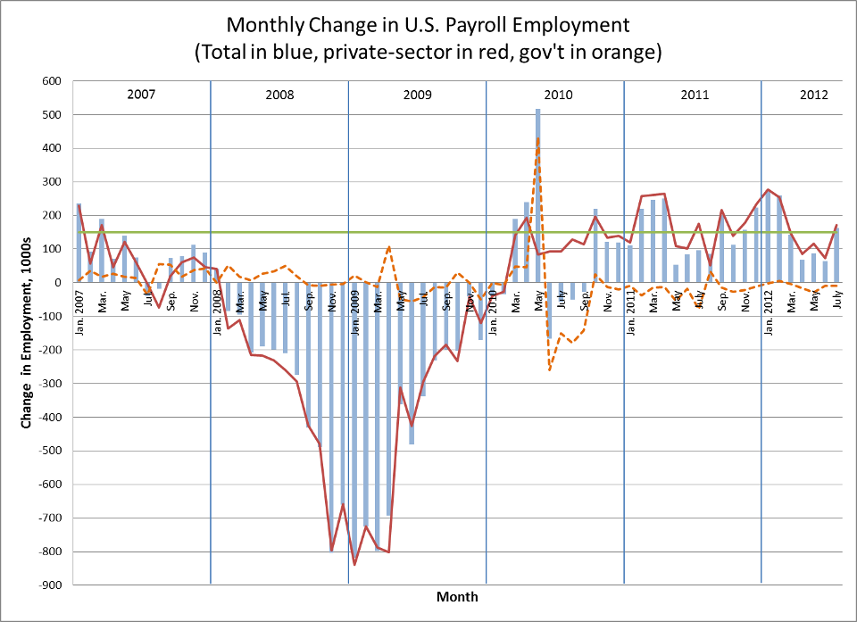
Chart 2. The following chart shows Payroll Employment for each month during the Clinton administration.
From the month in which Clinton was inaugurated (January 1993) to the month George W. Bush was inaugurated (January 2001), Payroll Employment increased from 109,725,000 to 132,469,000, an average of 236,900 jobs per month. This was higher than the rule-of-thumb 150,000, as the additional jobs created were bringing the unemployment rate down (see below). Job creation was erratic during the last half of 2000.
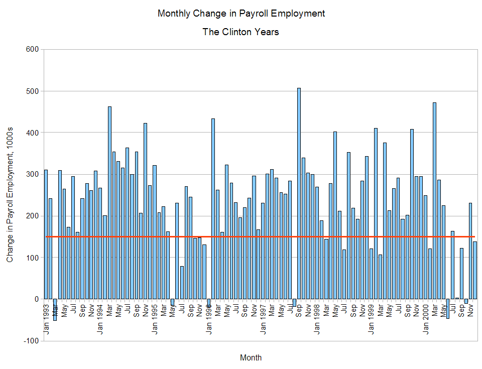
Chart 3. The following chart shows Payroll Employment for each month during the George W. Bush administration.
From the month in which Bush was inaugurated (January 2001) to the month Barack Obama was inaugurated (January 2009), Payroll Employment increased from 132,469,000 to 134,333,000, an average of 19,400 jobs per month.
(Peak Payroll Employment during the Bush administration was reached in December 2007, at 138,152,000, an average, through that point, of 68,400 jobs per month. Job creation had started faltering in the last half of 2000, and this continued until early 2004. This recession was underway BEFORE the 9/11 attack.)
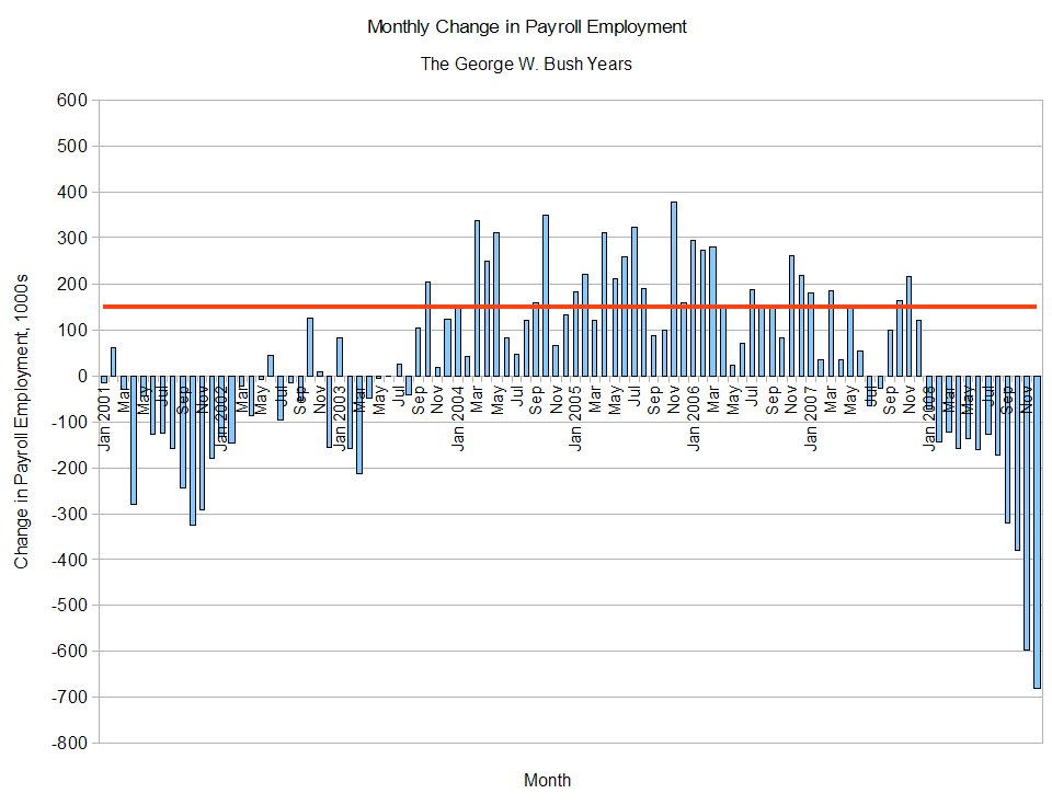
Chart 4. The following chart shows the recent unemployment rate. (See also "How the Government Measures Unemployment.")
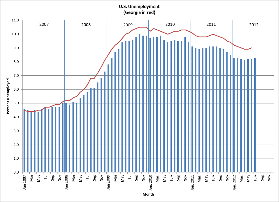
Chart 5. This chart shows the unemployment rate over a longer period.
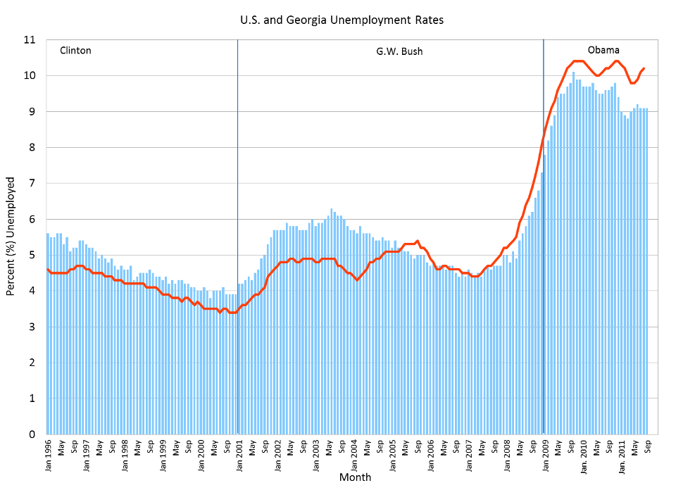
Chart 6. This chart shows a measure of unemployment among workers who are eligible for unemployment insurance. It shows the number of people who became unemployed each week, as indicated by their making an initial claim for unemployment benefits. (See further explanation below.) (Data through 8/27/2011)
In normal times, this is a measure of turnover, since people who become unemployed in one week may be reemployed soon after.
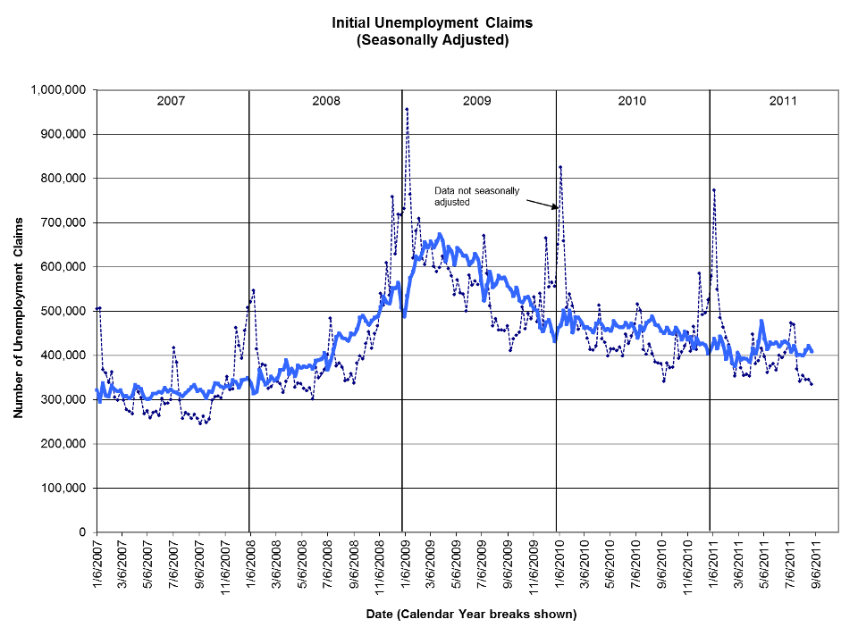
Chart 7. This chart is a companion to Chart 6. It shows the "continued" unemployment claims, that is, on-going claims after the initial claim. It's the total number of people who are drawing unemployment benefits at a given time. (See further explanation below.) (Data through 8/20/2011)
Information on Unemployment Insurance from http://www.bls.gov/cps/cps_htgm.htm:
Statistics on insured unemployment in the United States are collected as a by-product of [Unemployment Insurance] programs. Workers who lose their jobs and are covered by these programs typically file claims ("initial claims") that serve as notice that they are beginning a period of unemployment. Claimants who qualify for benefits are counted in the insured unemployment figures (as "continued claims"). Data on UI claims are maintained by the Employment and Training Administration, an agency of the U.S. Department of Labor, and are available on the Internet at: workforcesecurity.doleta.gov/unemploy/claims.asp.
Some countries base their estimates of total unemployment on the number of persons filing claims for or receiving UI payments or the number of persons registered with government employment offices as available for work. These data are also available in the United States, but they are not used to measure total unemployment because they exclude several important groups. To begin with, not all workers are covered by UI programs. For example, self-employed workers, unpaid family workers, workers in certain not-for-profit organizations, and several other small (primarily seasonal) worker categories are not covered.
In addition, the insured unemployed exclude the following:
- Unemployed workers who have exhausted their benefits
- Unemployed workers who have not yet earned benefit rights (such as new entrants or reentrants to the labor force)
- Disqualified workers whose unemployment is considered to have resulted from their own actions rather than from economic conditions; for example, a worker discharged for misconduct on the job
- Otherwise eligible unemployed persons who do not file for benefits
Because of these and other limitations, statistics on insured unemployment cannot be used as a count of total unemployment in the United States. Indeed, during 2008, only 36 percent of the total unemployed received UI benefits. The weekly data on UI claims do have important uses, however, and provide a timely indicator on labor market conditions.
Additional classifications (from www.bls.gov):
People "working part time" for economic reasons (sometimes referred to as involuntary part-time workers) were doing so because their hours had been cut back or because they were unable to find a full-time job. (9.2 million in November 2009)
People "marginally attached to the labor force" were not "in the labor force, wanted and were available for work, and had looked for a job sometime in the prior 12 months." They were not counted as unemployed because they had not searched for work in the 4 weeks preceding the survey. (about 2.3 million in November 2009)
Among the marginally attached are "discouraged workers," persons not currently looking for work because they believe no jobs are available for them. (861,000 in November 2009; not seasonally adjusted)
Revised 8/3/12